UI component libraries
UI libraries provide reusable components such as forms, menus and dialogs.
Use for: App interfaces, settings screens and dashboards.
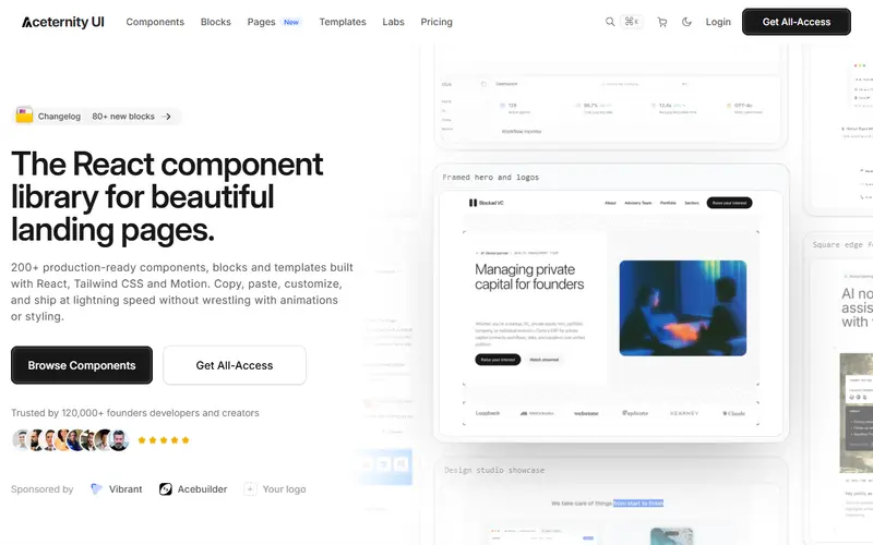
A collection of 200+ free animated React components built with Tailwind CSS and Motion for landing pages, plus paid All-Access blocks and templates.
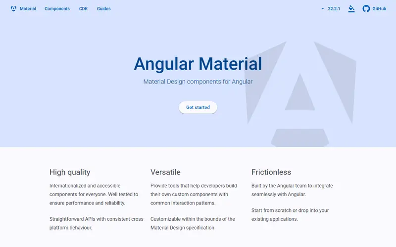
The Angular team's official Material Design component library, with the Component Dev Kit (CDK) and headless @angular/aria directives, MIT-licensed and versioned with Angular.
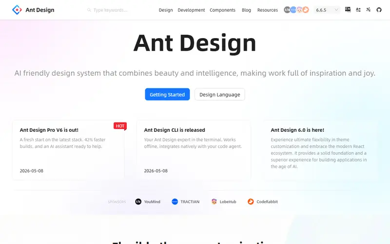
An MIT-licensed React library (antd) of enterprise-style components with detailed theming and dozens of locales; v6 shipped in November 2025 and requires React 18 or newer.
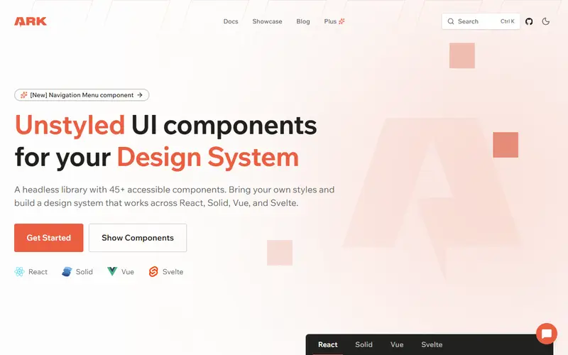
Headless, accessible components for React, Solid, Vue and Svelte from the Chakra UI team, built on Zag.js state machines, with a paid Ark Plus example pack.
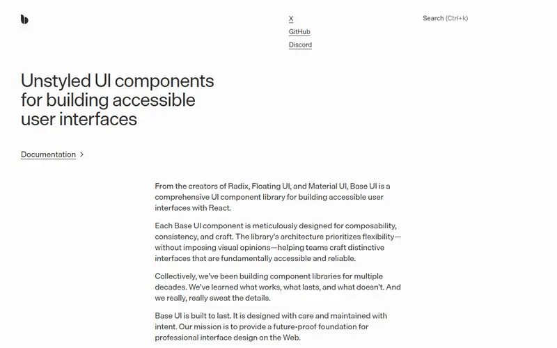
Unstyled, accessible React components from people behind Radix, Floating UI and Material UI, stable since December 2025 and one of shadcn/ui's two primitive layers.
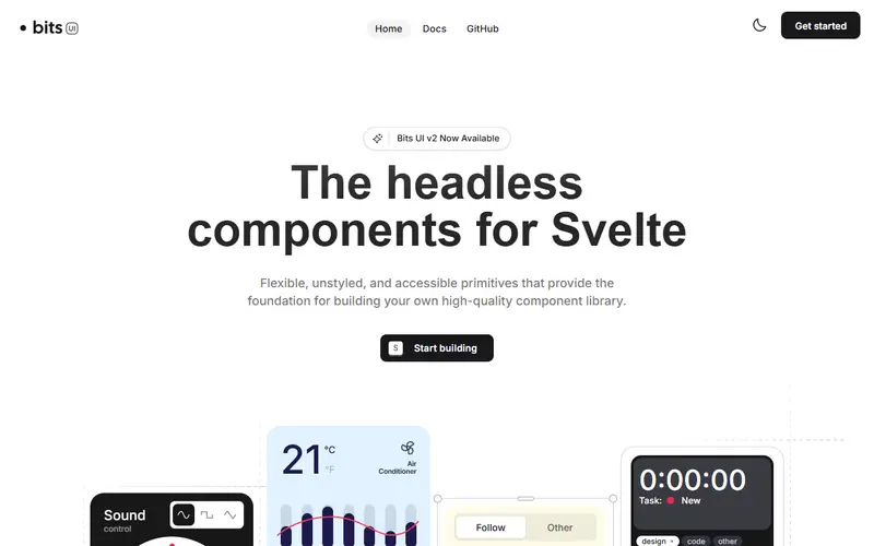
Headless, accessible Svelte components with render delegation and data-attribute styling, maintained by Hunter Johnston and used as the base of shadcn-svelte.
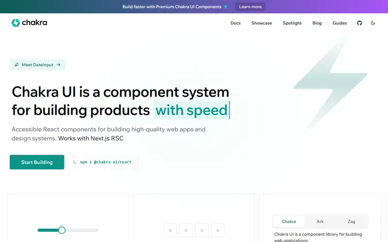
A styled, themeable React component library with a style-props system, CLI snippets and paid Chakra UI Pro blocks; it currently uses Emotion at runtime.
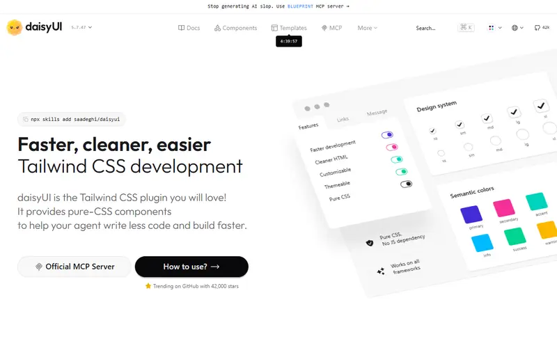
A Tailwind CSS plugin that adds semantic component class names such as btn, card and modal, with many themes, working in any framework or plain HTML.
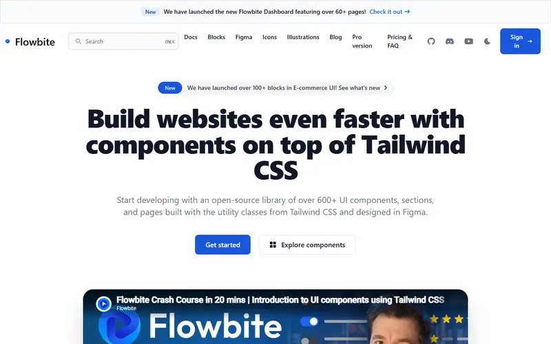
Open-source Tailwind CSS components with a small vanilla JavaScript layer for interactivity, plus Flowbite Pro: 450+ sections, app pages and Figma files for a one-time fee.
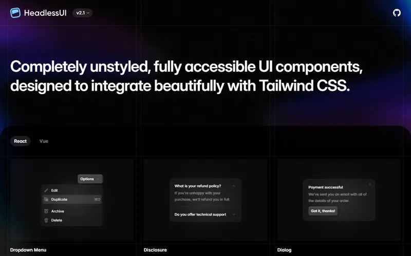
Tailwind Labs' small set of unstyled, accessible components (Menu, Listbox, Combobox, Dialog, Popover, Tabs and more) for React and Vue, designed to pair with Tailwind CSS.
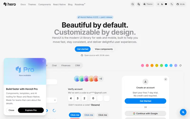
HeroUI, renamed from NextUI in January 2025, is a free React library on Tailwind CSS v4 and React Aria Components, with a React Native sibling and paid HeroUI Pro.
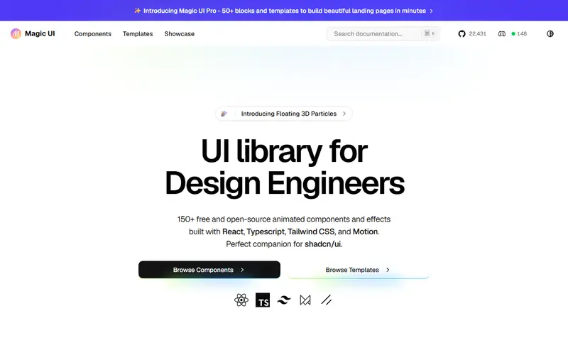
Free, MIT-licensed animated React components for landing pages (text effects, backgrounds, device mocks), copied in shadcn-style, with paid Magic UI Pro templates.
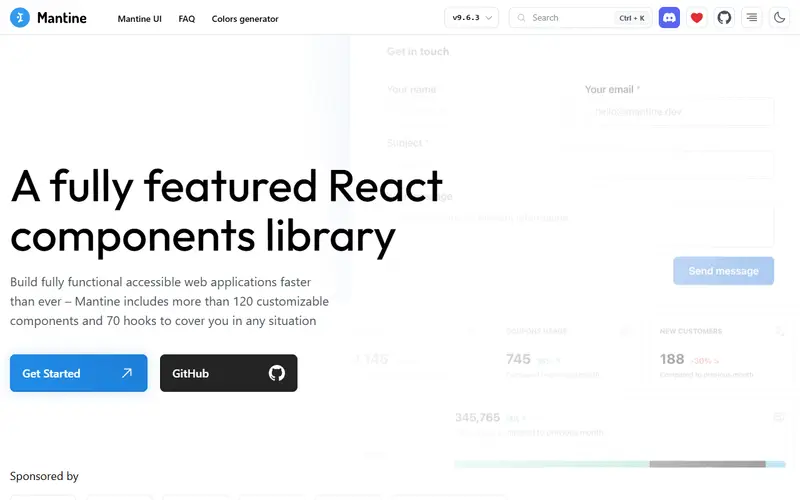
A free React library with 100+ styled components, 70+ hooks and packages for forms, dates, charts and notifications, styled with CSS modules rather than CSS-in-JS.
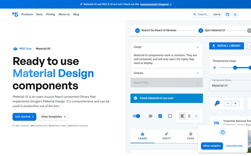
MIT-licensed React components implementing Material Design since 2014, with paid MUI X Pro and Premium licences for advanced data grid, charts, pickers and scheduler features.
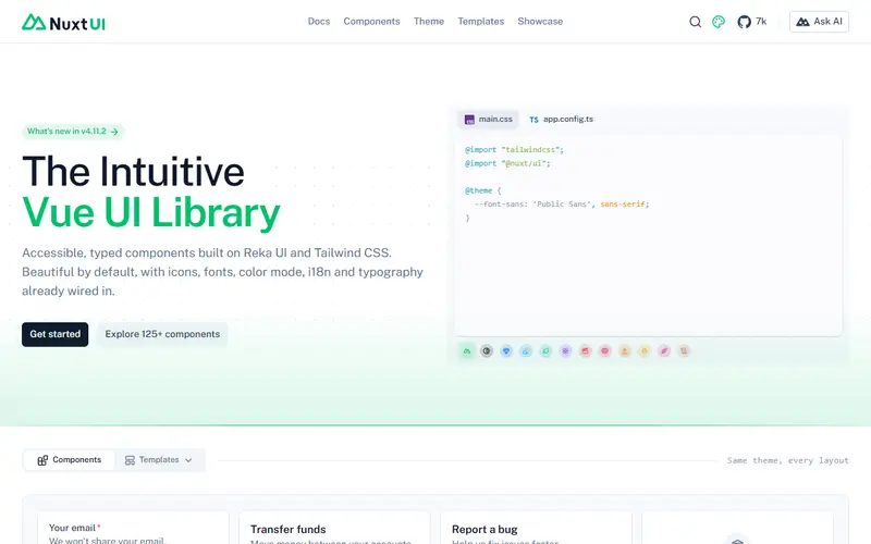
A free Vue component library with 125+ Tailwind CSS components on Reka UI; v4 (September 2025) merged the paid Nuxt UI Pro into it, including templates and the Figma kit.
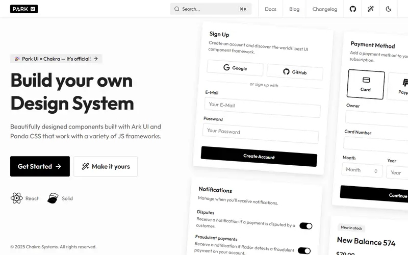
Styled, copy-in components built on Ark UI and Panda CSS for React, Solid and Vue, with a configurator for fonts, gray and accent colors and radius.
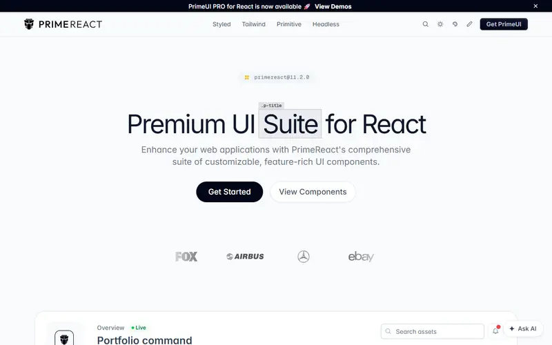
PrimeTek's 80+ component React suite with styled, unstyled and Tailwind modes; from v11 it is licensed under PrimeUI: free Community for small organisations, $599 per developer otherwise.
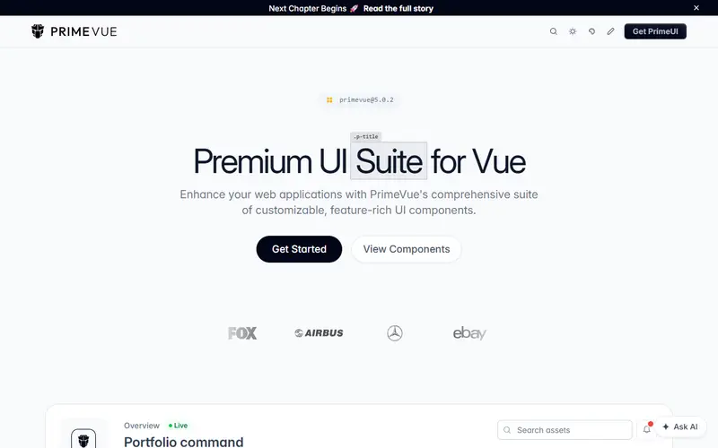
PrimeTek's 80+ component Vue suite with styled and unstyled modes; PrimeVue 5 is the first release under the PrimeUI licence, free only for eligible small organisations.
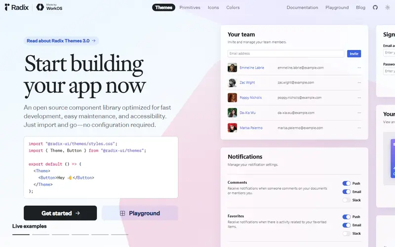
Unstyled, accessible React primitives such as Dialog, Dropdown Menu and Popover, maintained by WorkOS and used underneath shadcn/ui and many design systems.
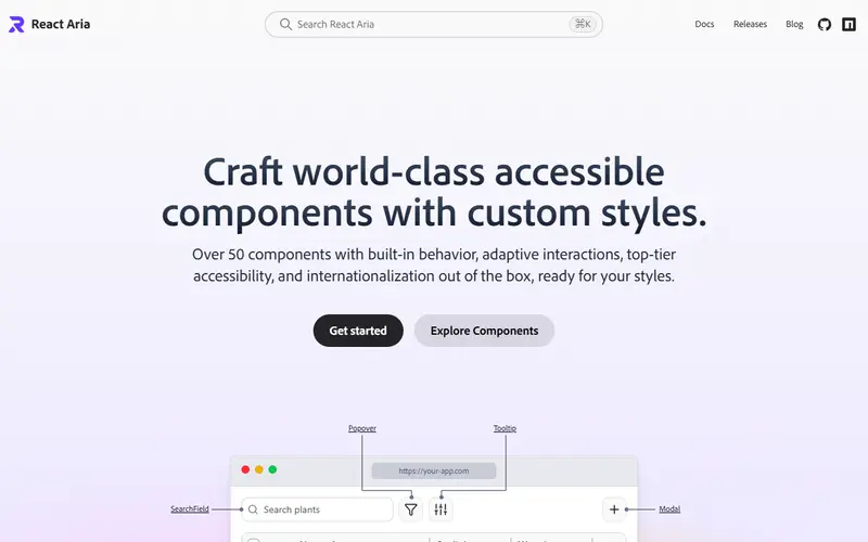
Adobe's React Aria provides 50+ unstyled components with deep accessibility and internationalization; React Spectrum is Adobe's styled design system built on it.
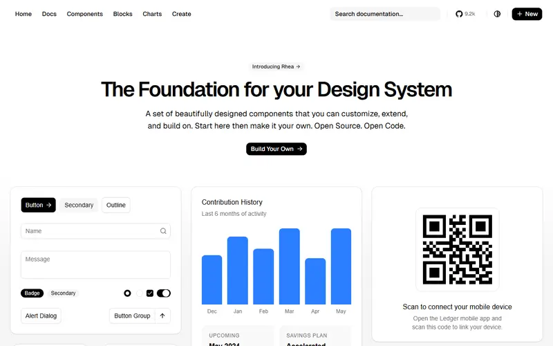
An unofficial, community-led Svelte port of shadcn/ui: copy-in components built with Bits UI and Tailwind CSS, targeting Svelte 5 and Tailwind v4.
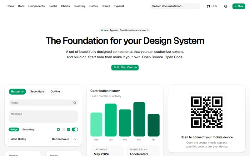
A community Vue port of shadcn/ui: a CLI copies Tailwind-styled, accessible Vue components into your project so you own and edit the code.
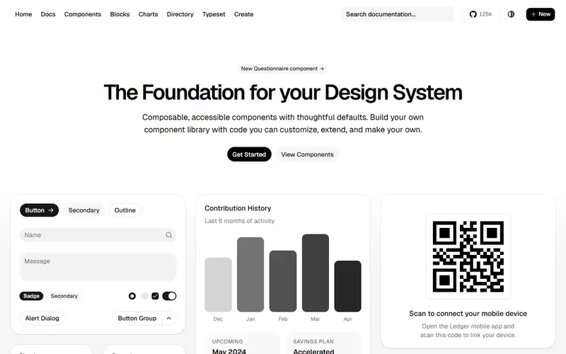
Open-source React components that a CLI copies into your project as source code, styled with Tailwind CSS and built on Radix, Base UI or React Aria primitives.
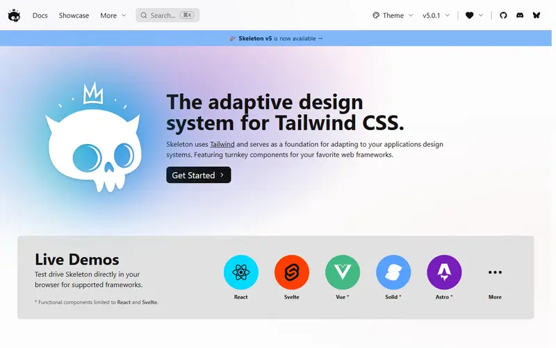
An open-source design system on Tailwind CSS with themes and utility classes, plus Zag.js-based component libraries for Svelte 5 and React.
The official paid Tailwind CSS collection (formerly Tailwind UI): 500+ UI blocks, Next.js templates and the Catalyst React kit, closed to new customers since September 2026.
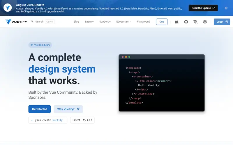
An MIT-licensed Vue component framework following Material Design, with layouts, themes and global defaults; Vuetify 4 (February 2026) moved styles into CSS layers.
| Tool | Pricing | For | Styling | How you get it | Paid extras |
|---|---|---|---|---|---|
| Aceternity UI ui.aceternity.com | Freemium | React (Next.js) | Tailwind CSS + Motion animations | Copy-in (copy code or shadcn CLI) | All-Access $169/yr or $199 lifetime; team $1,590 |
| Angular Material material.angular.dev · OSS | Open source | Angular | Sass themes and CSS tokens (Material Design) | Angular CLI schematic (ng add @angular/material) | None |
| Ant Design ant.design · OSS | Open source | React (18+) | CSS-in-JS tokens with CSS variables | npm package (antd) | None |
| Ark UI ark-ui.com · OSS | Freemium | React, Solid, Vue, Svelte | Unstyled (data attributes, any CSS) | npm package (@ark-ui/react, /vue, /solid, /svelte) | Ark Plus examples (one time; price not shown on current page) |
| Base UI base-ui.com · OSS | Open source | React (17 and newer) | Unstyled (Tailwind, CSS Modules, any CSS) | npm package (@base-ui/react) | None |
| Bits UI bits-ui.com · OSS | Open source | Svelte 5 | Unstyled (class props, data attributes) | npm package (bits-ui) | None |
| Chakra UI chakra-ui.com · OSS | Freemium | React | CSS-in-JS (Emotion) with style props and tokens | npm package plus CLI snippets | Chakra UI Pro blocks: Personal $299 one time |
| daisyUI daisyui.com · OSS | Freemium | Any (CSS only) | Tailwind CSS plugin, CSS variables themes | CSS plugin (@plugin "daisyui") | Store templates $19-$69 one time; Figma library from $49 |
| Flowbite flowbite.com · OSS | Freemium | Any (HTML + vanilla JS); React port | Tailwind CSS plugin with theme files | npm package + Tailwind plugin, or CDN | Pro Developer $299, Designer $169; Team $999 (one time) |
| Headless UI headlessui.com · OSS | Open source | React, Vue | Unstyled (built for Tailwind CSS) | npm package (@headlessui/react, @headlessui/vue) | None (Tailwind Plus was the related paid product) |
| HeroUI heroui.com · OSS | Freemium | React (plus HeroUI Native for React Native) | Tailwind CSS v4 with CSS variables | npm package (@heroui/react, @heroui/styles) | HeroUI Pro (perpetual licence; price not readable on page) |
| Magic UI magicui.design · OSS | Freemium | React (Next.js) | Tailwind CSS + Motion animations | Copy-in (shadcn CLI registry) | Magic UI Pro $199 one time |
| Mantine mantine.dev · OSS | Open source | React | CSS modules with CSS variables | npm packages (@mantine/core, @mantine/hooks...) | None (Mantine UI blocks are free) |
| Material UI (MUI) mui.com · OSS | Freemium | React | CSS-in-JS (Emotion) with CSS variables theme | npm package (@mui/material) | MUI X Pro $299, Premium $599 per dev/yr; templates $39-$69 |
| Nuxt UI ui.nuxt.com · OSS | Open source | Vue (Nuxt optional) | Tailwind CSS v4 + Tailwind Variants | npm package (@nuxt/ui) with Nuxt module or Vite plugin | None (Nuxt UI Pro made free in v4) |
| Park UI park-ui.com · OSS | Open source | React, Solid, Vue | Panda CSS preset and recipes | Copy-in components + Panda preset | None |
| PrimeReact primereact.dev | Freemium | React | Theme presets (design tokens), unstyled or Tailwind | npm package (primereact) with licence key | PrimeUI Commercial $599/dev (launch price, $799 from 2027) |
| PrimeVue primevue.org | Freemium | Vue | Theme presets (design tokens), unstyled or Tailwind | npm package (primevue) with licence key | PrimeUI Commercial $599/dev (launch price, $799 from 2027) |
| Radix UI radix-ui.com · OSS | Open source | React | Unstyled (any CSS; Radix Themes is styled) | npm package (radix-ui or @radix-ui/react-*) | None |
| React Aria and React Spectrum react-spectrum.adobe.com · OSS | Open source | React | Unstyled (CSS, Tailwind plugin); Spectrum 2 styled | npm package (react-aria-components) | None |
| shadcn-svelte shadcn-svelte.com · OSS | Open source | Svelte 5 (SvelteKit, Vite) | Tailwind CSS v4 with CSS variables (OKLCH) | Copy-in CLI | None |
| shadcn-vue shadcn-vue.com · OSS | Open source | Vue (Vite, Nuxt) | Tailwind CSS with CSS variables | Copy-in CLI (npx shadcn-vue add) | None |
| shadcn/ui ui.shadcn.com · OSS | Open source | React (Next.js, Vite, TanStack Start and more) | Tailwind CSS with CSS variables (OKLCH) | Copy-in CLI (npx shadcn add) | None |
| Skeleton skeleton.dev · OSS | Open source | Svelte, React (core design system: any) | Tailwind CSS plugin with themes | npm packages (@skeletonlabs/skeleton, -svelte, -react) | None |
| Tailwind Plus tailwindcss.com | Paid | HTML, React, Vue (templates: React/Next.js) | Tailwind CSS | Copy-in code from account; Elements JS library | Personal $299, Teams $979 one time (closed to new buyers) |
| Vuetify vuetifyjs.com · OSS | Open source | Vue (Vite, Nuxt) | Sass/CSS with CSS layers, theme system | npm package + scaffolder (pnpm create vuetify) | None required (enterprise support, Vuetify One perks) |
No tools match these filters.
How to choose a component library
- Match your framework first: many libraries are React-only, with separate ports for Vue and Svelte.
- Using Tailwind? Pick a Tailwind-based library (shadcn/ui, daisyUI, Flowbite) so you style everything one way.
- Copy-in libraries (shadcn/ui) put the code in your project: easy to change, but you maintain it. Package libraries (MUI, Mantine) update with npm, but you customise through their theme system.
- Unstyled (headless) libraries such as Radix, React Aria or Base UI handle behaviour and accessibility and leave the look to you: best when you have your own design.
Questions
Is shadcn/ui a component library?
Not in the usual sense. It is a set of components you copy into your project with a CLI, built on Radix (or Base UI) and Tailwind. You own the code, so there is no package to update and nothing stops you changing it.
Pricing changes
-
Tailwind Plus closes to new customers
Tailwind Plus · source ↗
-
PrimeReact moves to the commercial PrimeUI licence
PrimeReact · source ↗
-
PrimeVue moves to the commercial PrimeUI licence
PrimeVue · source ↗
-
Radix Primitives releases resume
Radix UI · source ↗
-
Material UI v9 and MUI X pricing and licensing change
Material UI (MUI) · source ↗