Overview
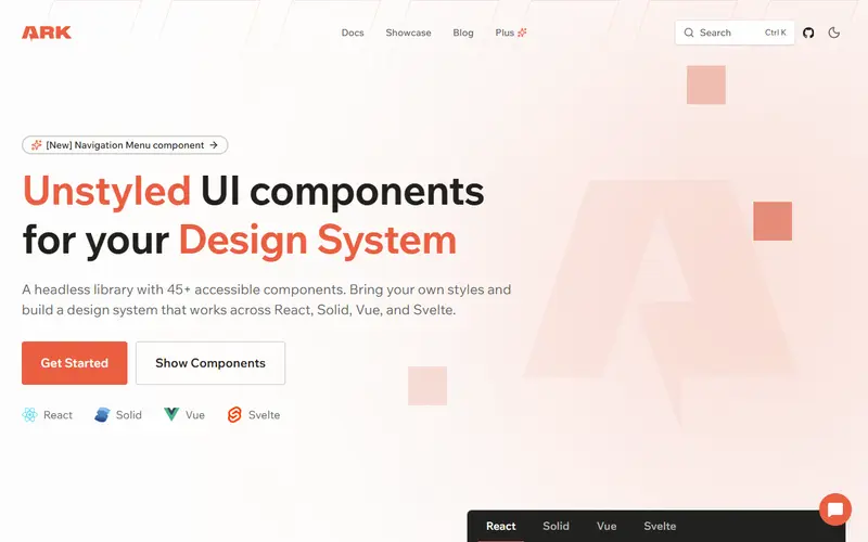
Ark UI is a headless component library for building accessible design systems across JavaScript frameworks. Its components (40+ including combobox, date picker, color picker, tags input, tree view, toast and more) are implemented as finite state machines in Zag.js that interact only with the DOM, while small adapters connect them to React, Solid, Vue and Svelte. The team says this keeps multi-framework support lightweight and that Ark UI performs well against single-framework headless libraries.
Because components are unstyled and expose state through data attributes, you can style them with Panda CSS, Tailwind, CSS Modules or anything else. Chakra UI v3 and Park UI are built on Ark UI, and Skeleton uses Zag.js directly. An MCP server is available for AI agents.
Ark UI is maintained by Chakra Systems, the company behind Chakra UI. Ark Plus is its paid add-on: premium composed examples such as a Combobox inside a Textarea, a Combobox with TagsInput, a command menu and a searchable menu, for React, Solid and Vue, sold with Personal and Team licences as a one-time purchase.
Pricing and plans
Free tier · no card
Ark UI components are free and open source; some Ark Plus examples are also free.
At the limit Not stated The vendor does not say what happens at the limit, or we have not found it yet.
| Plan | Price | What you get |
|---|---|---|
| Ark UI | Free | 40+ headless components |
| Ark Plus Personal | One-time, lifetime access to premium examples | |
| Ark Plus Team | All employees and contractors |
What it does
- Four frameworks
- The same components and APIs for React, Solid, Vue and Svelte.
- Zag.js state machines
- Component logic is framework-agnostic and shared across adapters.
- 40+ components
- Including date picker, color picker, tree view, tags input, file upload and toast.
- MCP server
- Lets AI agents look up component docs and examples.
- Ark Plus
- Paid premium composition examples with lifetime access.
Strengths and limitations
Strengths
- One headless library for several frameworks
- Company-maintained, powers Chakra UI v3
- Rich set of complex components
- Free core under an open-source licence
Limitations
- Unstyled; you build the visual layer or use Park UI
- Ark Plus has no free trial and no refunds
- Major versions (v3 to v5) have changed APIs; docs keep separate versions
- Smaller ecosystem than Radix in React
Who it suits
Good for
- Design systems that must support several frameworks
- Solid and Svelte teams needing complex accessible widgets
Look elsewhere if
- Teams wanting styled components with no design work
- Single-framework React teams already on Radix or Base UI
Alternatives to Ark UI
| Tool | From | Free option | Stages |
|---|---|---|---|
| Nuxt UI Styled Vue component library on Reka UI and Tailwind | — | ||
| HeroUI Styled React component library (formerly NextUI) | — | Free tier | |
| Material UI (MUI) Styled React component library with paid advanced components | $299/yr | Free tier | |
| Ant Design Enterprise React component library | — | ||
| shadcn-svelte Copy-in Svelte component collection and CLI | — | ||
| Vuetify Material Design component framework for Vue | — |
Questions
Which frameworks does Ark UI support?
React, Solid, Vue and Svelte.
What is the relationship between Ark UI and Chakra UI?
Both come from Chakra Systems, and Chakra UI v3 is built on Ark UI.
What is Ark Plus?
A paid, one-time purchase of premium composed examples built with Ark UI.
Sources read for this page