Overview
Radix Primitives is a set of unstyled React components for common widgets: accordion, checkbox, dialog, dropdown menu, popover, select, slider, tabs, tooltip, toast and more. Each follows the WAI-ARIA design patterns where possible and handles focus, keyboard support and aria attributes. Components are uncontrolled by default but can be controlled, and an asChild prop lets you render the behaviour onto your own element.
Since January 2025 the recommended install is a single tree-shakeable radix-ui package; individual @radix-ui/react-* packages still exist, and the July 2026 release added per-primitive subpath imports such as radix-ui/accordion. The project started in 2020 and its GitHub repository says it is maintained by WorkOS.
Maintenance pace is worth knowing. The public release log shows regular releases through August 2025, then no entries until June 2026, when releases resumed with new composition APIs and many bug fixes. Several Radix authors now work on Base UI, and shadcn/ui offers Base UI as an alternative primitive layer. Radix is not deprecated, but check the release log if you depend on complex components such as Select or Navigation Menu.
Pricing and plans
| Plan | Price | What you get |
|---|---|---|
| Open source | Free | MIT licence, copyright WorkOS |
What it does
- Accessible behaviour
- Implements WAI-ARIA patterns including focus management, roles and keyboard navigation.
- Unstyled parts
- Every component is split into parts you style with any CSS approach.
- asChild composition
- Merges a primitive's behaviour onto your own element instead of rendering a wrapper.
- Single package
- The radix-ui package exposes all primitives, tree-shaken, with subpath imports per primitive since July 2026.
- Radix Themes
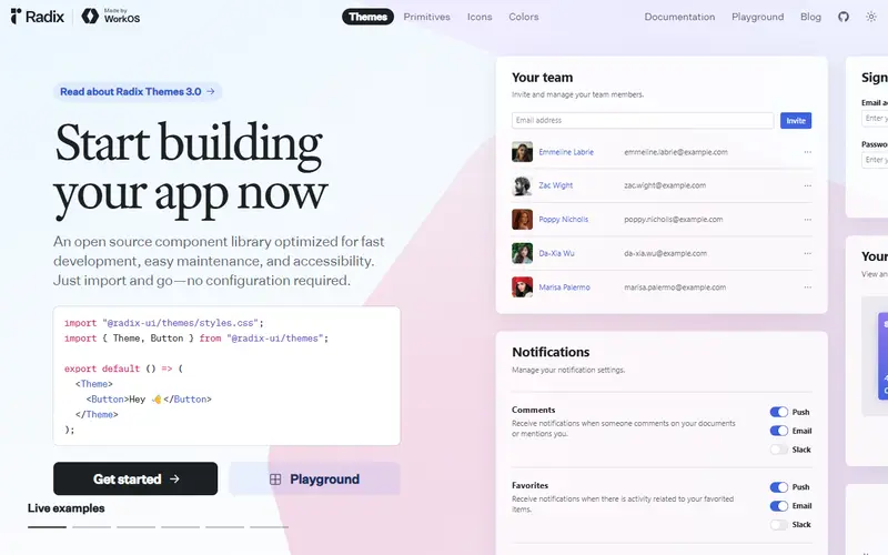
- A separate styled component library built on the primitives for teams that want defaults.
Strengths and limitations
Strengths
- Widely used foundation, including under shadcn/ui
- Fully typed, consistent API across primitives
- Incremental adoption: use one primitive or all
- MIT licence with a company maintainer
Limitations
- React only
- You write all styling yourself unless you use Radix Themes or shadcn/ui
- The release log shows a gap from August 2025 to June 2026, so fixes can be slow
- Components are client-side and need a client boundary in React Server Components apps
Who it suits
Good for
- Design system teams that want accessible behaviour without imposed styles
- Existing shadcn/ui projects on the Radix base
- React apps adopting primitives one at a time
Look elsewhere if
- Vue, Svelte or Angular projects
- Teams wanting a fully styled library out of the box
Pricing history
-
Radix Primitives releases resume
After no releases since 13 August 2025, Radix published a release on 6 June 2026 with new composition APIs and fixes, followed by further releases in June and July 2026. Source ↗
Alternatives to Radix UI
| Tool | From | Free option | Stages |
|---|---|---|---|
| Material UI (MUI) Styled React component library with paid advanced components | $299/yr | Free tier | |
| PrimeVue Vue component suite (commercial licence from v5) | — | Free tier | |
| PrimeReact React component suite (commercial licence from v11) | — | Free tier | |
| Vuetify Material Design component framework for Vue | — | ||
| Ant Design Enterprise React component library | — | ||
| Base UI Unstyled accessible React components | — |
Questions
Is Radix UI still maintained?
Yes. WorkOS maintains it, and releases resumed in June 2026 after a gap since August 2025.
What is the difference between Radix Primitives and Radix Themes?
Primitives are unstyled behaviour components; Themes is a styled library built on top of them.
Should I use Radix or Base UI with shadcn/ui?
Both are supported. Radix has the longer track record; Base UI is newer and more actively released in 2026.
Sources read for this page