Overview
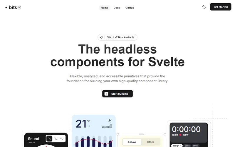
Bits UI is a headless component library for Svelte focused on developer experience, accessibility and full styling control. Most components ship completely unstyled except where styles are required for core behaviour, and there are no CSS resets. You pass classes directly or target data-* attributes that expose component state.
Accessibility is built in: WAI-ARIA compliance, keyboard navigation, focus management and screen reader support. Components are composable primitives with render delegation for custom elements, chainable events and override-friendly defaults. The date and time components take inspiration from React Spectrum, the API design from Radix, and the internal architecture from Melt UI.
Bits UI is built and maintained by Hunter Johnston, with design support from Bitworks Studio. It underpins shadcn-svelte, so its release cadence directly affects that project. If you want the same behaviour with ready-made styles, start with shadcn-svelte; if you are building your own design system, use Bits UI directly and add your own class names or data-attribute selectors.
Pricing and plans
| Plan | Price | What you get |
|---|---|---|
| Open source | Free | MIT licence |
What it does
- Headless components
- Dialog, Popover, Menu, Select, Combobox, Tabs, Slider, Calendar, DatePicker and more.
- Render delegation
- Render primitives as your own elements or components.
- Date and time
- Accessible calendar, date field and range components.
- Typed API
- Full TypeScript coverage with stable, predictable APIs.
Strengths and limitations
Strengths
- Most complete headless library for Svelte 5
- Strong date and time components
- Foundation of shadcn-svelte
- No styling assumptions
Limitations
- Svelte only
- You write all styles yourself
- Largely maintained by one person, so bus factor is low
- Complex widgets still need your own styling work before they look finished
Who it suits
Good for
- Svelte teams building a design system
- Apps needing accessible date pickers in Svelte
Look elsewhere if
- Teams wanting styled components out of the box (use shadcn-svelte or Skeleton)
- Non-Svelte projects
Alternatives to Bits UI
| Tool | From | Free option | Stages |
|---|---|---|---|
| shadcn-svelte Copy-in Svelte component collection and CLI | — | ||
| Chakra UI Styled React component library | — | Free tier | |
| shadcn-vue Copy-in Vue component collection and CLI | — | ||
| shadcn/ui Copy-in React component collection and registry CLI | — | ||
| Radix UI Unstyled accessible React primitives | — | ||
| HeroUI Styled React component library (formerly NextUI) | — | Free tier |
Questions
Is Bits UI styled?
No. Components are headless; shadcn-svelte provides a styled layer on top.
Who maintains Bits UI?
Hunter Johnston, with design support from Bitworks Studio and community contributors.
Bits UI or Melt UI?
Bits UI offers component-style primitives and cites Melt UI as the inspiration for its internals.
Sources read for this page