Overview
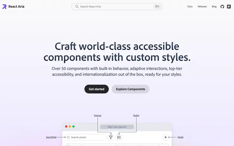
React Aria is Adobe's library for building accessible components with custom styles. The react-aria-components package offers over 50 components (date pickers, combo boxes, tables, drag and drop, color pickers, trees and more) with adaptive mouse, touch and keyboard interactions and internationalization built in. Lower-level hooks from react-aria and react-stately remain available when you need full control.
Styling is up to you. Each component gets a default class name and exposes states as data attributes (for example data-pressed or data-selected) and render props, and there is a Tailwind plugin for those states. The getting-started page offers vanilla CSS and Tailwind starter kits you can copy, download or install with shadcn.
React Spectrum is Adobe's styled implementation of its Spectrum design system. Spectrum 2 reached v1.0 alongside a rewritten documentation site with MCP servers and agent skills, and a codemod helps migrate from React Spectrum v3. Spectrum 2 styling uses a build-time style macro and discourages class overrides, so it suits teams adopting Adobe's look rather than their own.
Pricing and plans
| Plan | Price | What you get |
|---|---|---|
| Open source | Free | React Aria, React Stately and React Spectrum |
What it does
- 50+ components
- Includes complex widgets such as DatePicker, Table, Tree, ComboBox, ColorPicker and drag and drop.
- Internationalization
- Localized date and number formatting and right-to-left behaviour are built in.
- State data attributes
- Style hover, pressed, selected and focus states with CSS attribute selectors or the Tailwind plugin.
- Hooks layer
- react-aria and react-stately hooks let you build fully custom DOM structures.
- Spectrum 2
- Adobe's styled design system on top of React Aria, with a v3 to S2 codemod and agent skill.
Strengths and limitations
Strengths
- Strongest date, time and internationalization support among headless libraries
- Maintained by Adobe and used in its products
- Foundation for HeroUI and a shadcn/ui option
- Starter kits in plain CSS and Tailwind
Limitations
- React only
- More verbose component composition than simpler libraries
- React Spectrum's style macro discourages custom class overrides
- React Aria Components ship without visual styles
Who it suits
Good for
- Accessibility-critical products and enterprise apps
- International apps with dates, numbers and RTL layouts
- Design system teams needing complex widgets
Look elsewhere if
- Vue, Svelte or Angular projects
- Quick prototypes that want styled defaults (use HeroUI or shadcn/ui)
Alternatives to React Aria and React Spectrum
| Tool | From | Free option | Stages |
|---|---|---|---|
| Angular Material Official Material Design components for Angular | — | ||
| PrimeReact React component suite (commercial licence from v11) | — | Free tier | |
| Base UI Unstyled accessible React components | — | ||
| Vuetify Material Design component framework for Vue | — | ||
| Ant Design Enterprise React component library | — | ||
| PrimeVue Vue component suite (commercial licence from v5) | — | Free tier |
Questions
What is the difference between React Aria and React Spectrum?
React Aria is unstyled behaviour and accessibility; React Spectrum is Adobe's styled design system built on it.
Can I use React Aria with Tailwind?
Yes. There is a Tailwind plugin for component states and a Tailwind starter kit.
Which libraries use React Aria?
HeroUI is built on React Aria Components, and shadcn/ui offers some components for React Aria.
Sources read for this page