Overview
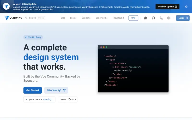
Vuetify is a Vue component framework built around Google's Material Design specification, though components have enough options to fit other visual styles. Beyond components it includes dynamic themes, global component defaults, application layout components and tooling: the create-vuetify scaffolder, a CLI that reached v1.0 in February 2026, a Nuxt module and an MCP server with migration tooling.
Vuetify 4.0.0 (Revisionist) was released on 23 February 2026 after four betas. It organises all styles in CSS @layer blocks, replacing !important and making it easier to combine with Tailwind CSS or UnoCSS, adopts Material Design 3 typography and elevation, overhauls the grid, changes the default theme to follow the system setting and trims the CSS reset. The team describes the migration as minimal and continues to maintain the v3 line.
The project states it is MIT-licensed and funded by sponsors and backers. The roadmap points to Vuetify0, a headless composable layer, as the base for a future Vuetify 5 where the component library and headless primitives share one architecture.
Pricing and plans
| Plan | Price | What you get |
|---|---|---|
| Open source | Free | MIT licence |
| Enterprise support | Offered for individuals and businesses; price not published on the pages read |
What it does
- Material components
- Data tables, date pickers, navigation drawers, forms, dialogs and many more Vue components.
- CSS layers
- Since v4 all styles live in @layer blocks so utility frameworks can override them.
- Themes and defaults
- Dynamic themes and global defaults configure components app-wide.
- Scaffolding CLI
- pnpm create vuetify generates a Vite project; a Nuxt setup is documented.
- Labs components
- New components such as a command palette arrive first in labs before becoming stable.
Strengths and limitations
Strengths
- Mature and complete Vue library
- Material Design out of the box
- Active monthly development updates
- Free under MIT
Limitations
- Material Design look takes work to replace
- v4 changed typography, elevation, breakpoints and the grid, so visual regressions need checking
- Nuxt integration needs manual Vite plugin config or a community module
- Vue only
Who it suits
Good for
- Vue admin panels and business apps
- Teams wanting Material Design
- Nuxt apps needing a full component set
Look elsewhere if
- Tailwind-first designs (see Nuxt UI)
- React, Svelte or Angular projects
Pricing history
-
Vuetify 4 released
Released 23 February 2026: styles moved into CSS layers, Material Design 3 typography and elevation, and a grid overhaul; the v3 line continues to receive releases. Source ↗
Alternatives to Vuetify
| Tool | From | Free option | Stages |
|---|---|---|---|
| Radix UI Unstyled accessible React primitives | — | ||
| Base UI Unstyled accessible React components | — | ||
| PrimeReact React component suite (commercial licence from v11) | — | Free tier | |
| Angular Material Official Material Design components for Angular | — | ||
| Material UI (MUI) Styled React component library with paid advanced components | $299/yr | Free tier | |
| PrimeVue Vue component suite (commercial licence from v5) | — | Free tier |
Questions
When was Vuetify 4 released?
Vuetify 4.0.0 was released on 23 February 2026.
Can Vuetify be used with Tailwind?
Yes. Vuetify 4 puts its styles in CSS layers so utility frameworks such as Tailwind or UnoCSS can override them.
Is Vuetify free?
Yes, it is MIT-licensed; enterprise support is optional.
Sources read for this page